This is Part 3 of a three-part series on building the Prerender.io Design System – a front-end foundation built with Claude Code and Figma, designed to serve as a single source of truth across all Prerender.io products.
Part 1: From Figma to Front-End Without Losing Your Mind
Part 2: Building the Prerender.io Design System, Wave by Wave
There’s a version of this post where I tell you that Claude Code solved everything and design-to-code pipelines are a done deal. That version would be shorter, more satisfying to share, and not really honest.
The real version is more interesting.
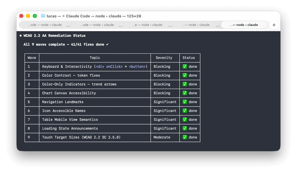
After building the Prerender.io Design System together: tokens, components, accessibility audit, responsive behaviour, chart library, the whole stack; I came away with a different mental model for what AI collaboration actually is. And what it asks of you.
Here’s what I actually learned.
Claude executes the brief it’s given, not the one in your head
If you don’t specify something, it won’t happen. This took me a few waves to properly internalise.
Early on, I forgot to mention responsiveness. The components were built, looked great at 1440px, and Claude didn’t raise a flag. It just built what I described. When I eventually asked about mobile behaviour, it handled it well, but I had components that needed reworking.
The lesson isn’t that Claude is negligent. It’s that it’s not a designer. A designer would spot the gap and raise it. Claude executes the prompt. The implication: your brief needs to be more complete than feels necessary, especially for things that feel obvious to you.
The same logic applies to session continuity. Claude has no memory between sessions. If you don’t give it something to read at the start: a wave plan document, a status file, a summary of where things stand, it starts fresh. And “starting fresh” on a copule of days build is expensive. The wave plan we kept wasn’t just a project management tool. It was the session handoff. The first message of every resumed session was always: “Read the plan, find the first pending item, continue from there.” Everything else followed from that.
Nested details aren’t ignored, they’re invisible
If a variable lives deep inside a Figma component’s variant states, or a colour token is nested three levels into the component tree, there’s a real chance Claude won’t pick it up (and it’s super frustrating).
This is worth being precise about: it’s not inattention. It’s an information access problem.
Claude works carefully with what’s in its context. If get_design_context doesn’t surface a detail, because it lives inside a variant that wasn’t referenced, or a sub-component that wasn’t specifically pointed to, it simply doesn’t exist from Claude’s perspective.
The practical implication runs in two directions. First, structure your Figma components so that the details you care about are visible at the level you’re pointing Claude at, not buried inside 6848393939-level frame. Second, audit the output regardless. Hardcoded hex values where token references should be, spacing values that are close but not quite on scale. These sneak through, and they’re worth catching wave by wave. Re-run checks, don’t assume Claude remembers all of your commands.
Scope determines quality
When Claude is given a task that’s too large or too vague, something shifts in the output. Assumptions appear that don’t get flagged. Finishing takes priority over finesse.
Claude allocates attention across the full scope of a task. The larger the scope, the less each individual component receives. A focused, bounded task gets concentrated processing.
The fix is to break tasks down more aggressively than feels necessary. Not “build the dashboard page”, but “build the metric card row using these three StatCard instances with these specific props.” The more bounded the task, the more deliberate the output.
This was probably the single most impactful habit change I made across the whole project.
What if you run two agents?
Toward the end of the project I started testing something I think has real potential: running a few agents in parallel. For example: one as the builder and another as the UX auditor, its only job is to review what the builder produced and point out where it doesn’t match the design or violates the design principles.
Before the builder starts, both agents agree on a plan, an approach, and a confidence level. Then the auditor reviews the output. Then the builder takes it from there.
The feedback loop is much tighter than a single agent trying to self-critique. The auditor role catches things a build pass tends to skip: visual hierarchy inconsistencies, missing hover states, components that technically work but don’t feel right.
I haven’t fully operationalised this pattern yet, but it’s promising enough to mention.
What can mock data tell you?
One thing that genuinely surprised me: asking Claude to progressively fill in mock data tells you a lot about whether it actually understands the business logic or just the visual layer.
Early in one of the projects the dashboard had placeholder numbers. I asked Claude to enrich the mock data to reflect a real customer account. What came back was plausible in structure but thin in nuance.
Each subsequent enrichment request produced better data as Claude accumulated more context about what the numbers meant and how they related. By the third or fourth pass, the mock data was telling a coherent story, not just filling cells. At that point you know Claude understands the product, not just the UI.
DS updates propagate surprisingly well
One thing that works remarkably well: making a change to the Design System and asking Claude to apply it to dependent projects.
When I updated colour tokens, added new CSS custom properties, or adjusted component-level theming, Claude could trace the dependency chain and apply changes cleanly and consistently. The token architecture made it possible, but the ability to follow that chain across project boundaries and apply changes in the right places was impressive.
The fear with a Design System is usually that it becomes a legacy artefact the moment it ships. With Claude as the propagation layer, that fear is significantly lower.
Your domain expertise is the multiplier
The more you understand your field, the better your prompts. I know this sounds obvious. The skill differential is real.
This leads me to believe that for design system work specifically, the best outcomes come from UX and front-end working together from the start. A UX designer who understands design best practices and component architecture, alongside a Front-End developer, that combination extracts far more from the toolchain than either working alone.
AI doesn’t reduce the value of expertise. It amplifies it. Solid foundations produce better output. Shaky ones produce faster chaos.
So where does this leave me?
Claude Code is the most useful tool I’ve found for bridging the design-to-code gap at the architecture level. Not because it’s magic, but because it runs locally, it doesn’t impose a framework or platform, and it executes a well-defined plan well.
The catch is that “well-defined” is doing a lot of work in that sentence.
The quality of the output is a direct function of the quality of the input. The human side of this collaboration isn’t going away. It’s getting more interesting.
The pattern across all of this is brief quality: specify what matters, keep tasks bounded, and bring your domain knowledge into the prompts. It sounds straightforward. In practice it means doing more thinking upfront than feels natural when you have a capable tool waiting. Structure your Figma components so the details you care about are surfaced at the level you’re pointing Claude at, then audit the output regardless. Use mock data enrichment as a diagnostic: it tells you whether Claude has absorbed the business logic or just the visual layer. And if you haven’t tried the two-agent pattern on something complex, it’s worth the setup: the feedback loop between a builder and an auditor is tighter than single-agent self-critique. None of this happened quickly. It took more rounds of iteration than I expected before the system and the projects were where I wanted them.
The Prerender.io Design System is now the foundation for every Prerender.io branded product going forward. That was the goal from the start: a single source of truth that propagates. It took longer than a no-code generator and required more thinking than a template. It also actually works.