The answer might be easy like: because they are beautiful. Yes, indeed, but it’s a little more cmplex than this. Behind the stylish and elegant layout there is well-thought and effective UX strategy. Today I would like to share some of the great examples.
Play with the grid
The site structure and its grid are saint. There is no question that there should be the order and neatness in that area. But if you define 12 or 16 column grid it doesn’t mean it will be boring and there is no room for imagination. Divide the page into horizontal segments and within each of them put together some columns and see the magic happens.
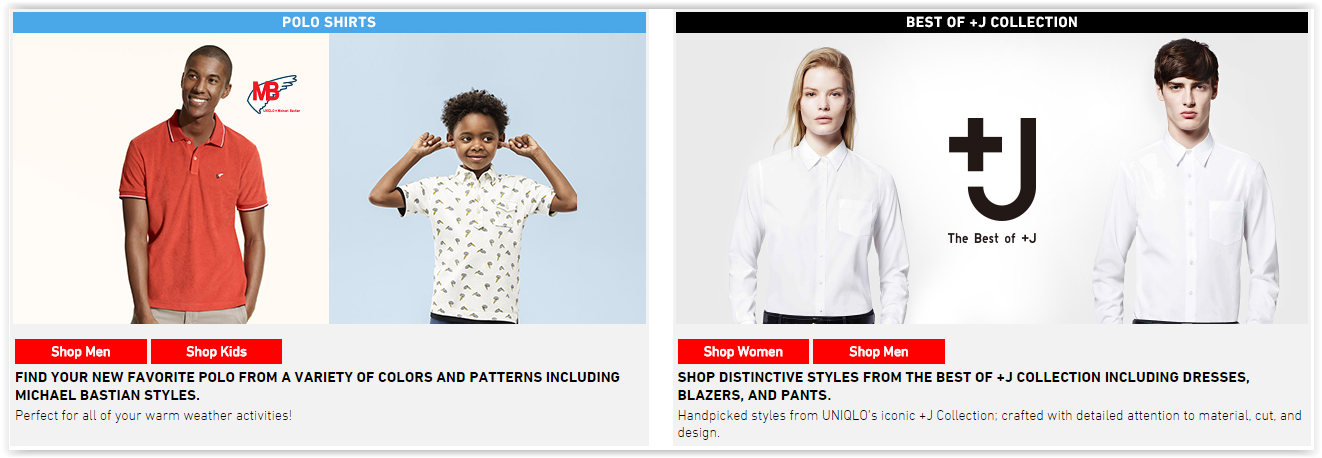
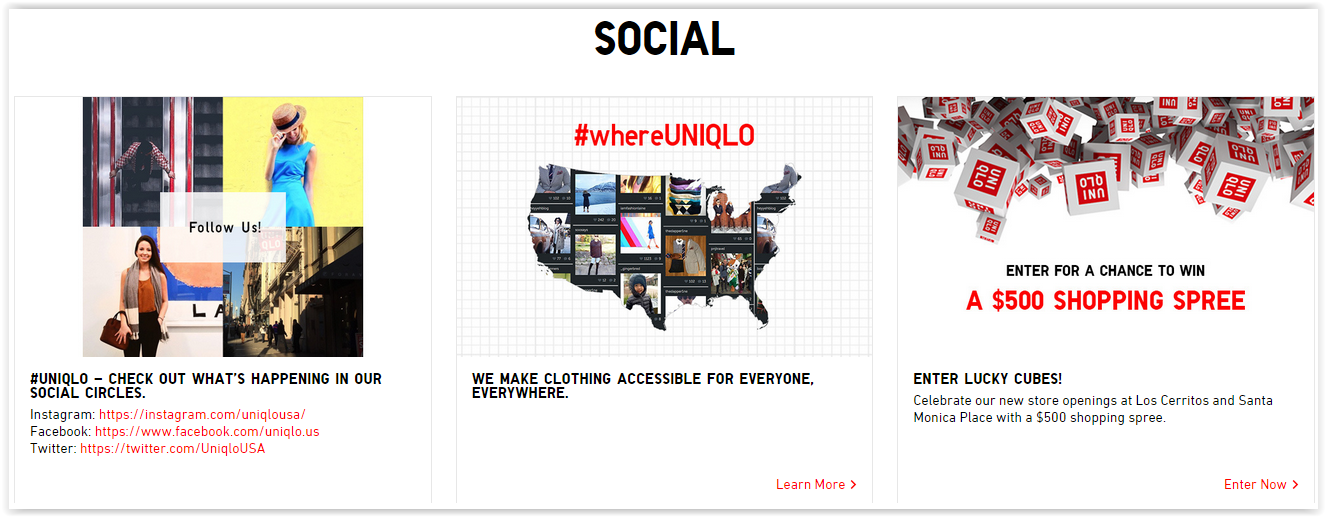
When you have 3-column than 4-column grid and then there is 100% wide section your website is more interesting and the message you are trying to say can be easily highlighted. Let me show you the great example: http://www.uniqlo.com/us/
50/50
and below there is a centered single message slot
100
and a 3 column grid
30/30/30
This is how you play with the grid within hub pages, but what about the category page. The easiest way is to show a hero product twice as big as other ones. Have a look at: https://www.quatuor.be/fr-wr
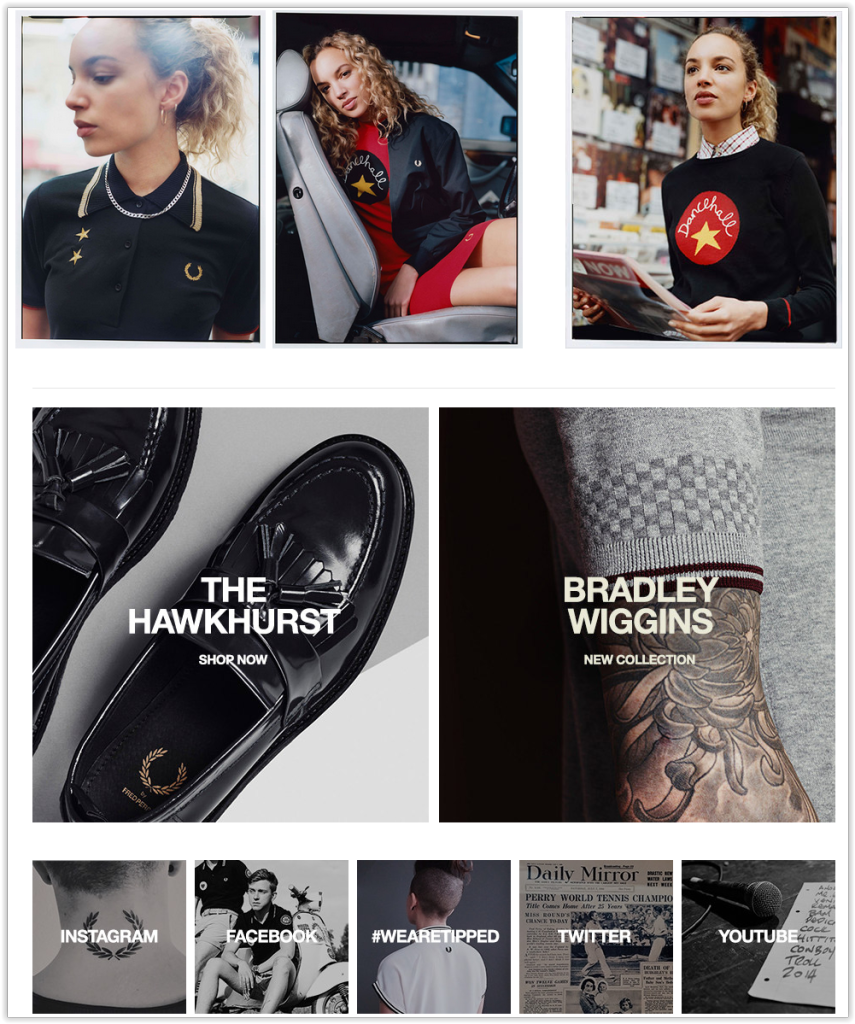
And another great example of a mixed grid: http://www.fredperry.com/ . The higher the content is the bigger the boxes are, so the approach provides the idea that the information is more important the bigger slot it gets and the higher visual position in the vertical space it gets – a very simple and straightforward way.
Product sneak peak
When we are talking about the category page, usually there is a grid with tons of images. It’s good to have some introduction into your goods and give the suggestions to the user in other way than “Promotions” or “Recommended for you” which is marketing from hell in the purest form.
Take a glance: https://www.reiss.com/eu/womens/
On the left-hand side you might see a discreet video with the examples from the whole collection. On the right-hand side there are recommended products from various subcategories. Imagine how it would work with phones (brand + models) or series (trailer + seasons)?
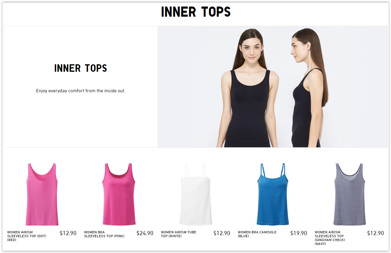
Uniqlo.com has a similar concept. The category page provides a main visual and recommended products for each subcategory: http://www.uniqlo.com/us/women/innerwear-and-loungewear.html
Get social
Everybody is talking about social media and sharing buttons are widely spread across the websites. What can be done to use social media in a bit smarter way? Let the real users make recommendations instead of a system like Etsy.com:

And give your product a friendly face:
Microanimations
And don’t forget to be dynamic. It happens that the wireframes and graphic designs are analyzed like pictures without any other then tap or click interactions.
There is quite a number thing you can do to improve user comfort using only scroll action, like here http://demo.krownthemes.com/shadow/ There is plenty of dscreet animations within the site, just have a look at the menu and icons within the content
Let’s say you want to preserve at all costs and it’s quite complex, make it a global breadcrumb like there http://www.webtrends.com/products-solutions/analytics/
Initial status
After scrolling
What else?
There is plenty more inspirations connected with small UX hacks that make users’ life easier in for exmaple in filtering and product pages. And I will get back to them soon.


